OFFSET 3 COLORS POSTER
INTRODUCTION
Imaginative design solutions often result from the designer’s riposte to creative or commercial constraints. They can be constraints of time, money, or production; they usually involve client directives or restrictions. The means of production and inventive use of color can do much to mitigate such constraints. Well executed, they can transform the ordinary or mundane into the extraordinary, the exemplary.
OBJECTIVES
> To examine ways to leverage the possibilities of overprinting and the power of compounding color and form to advance creative design solutions
> To gain knowledge about color use for offset lithography printing
PROBLEM
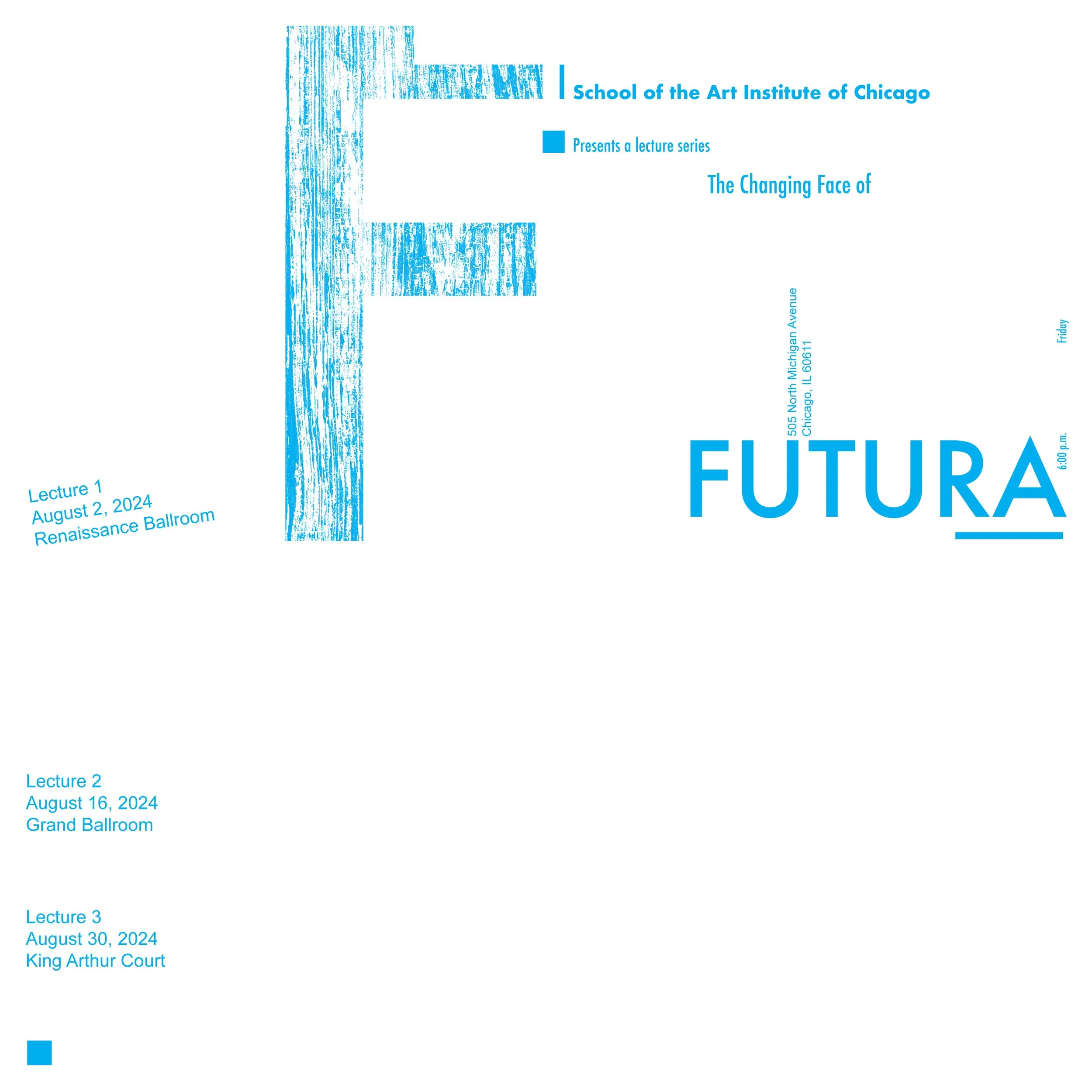
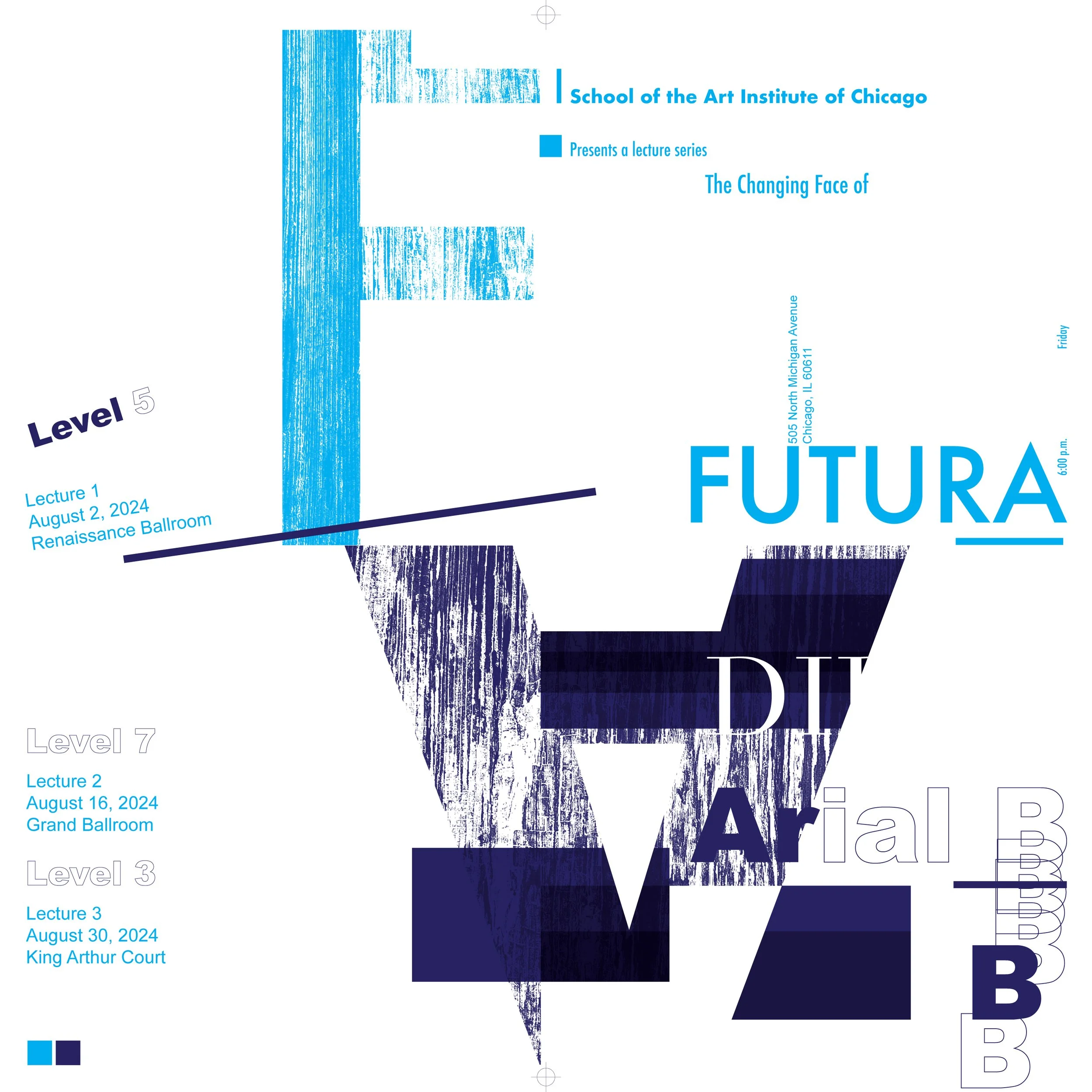
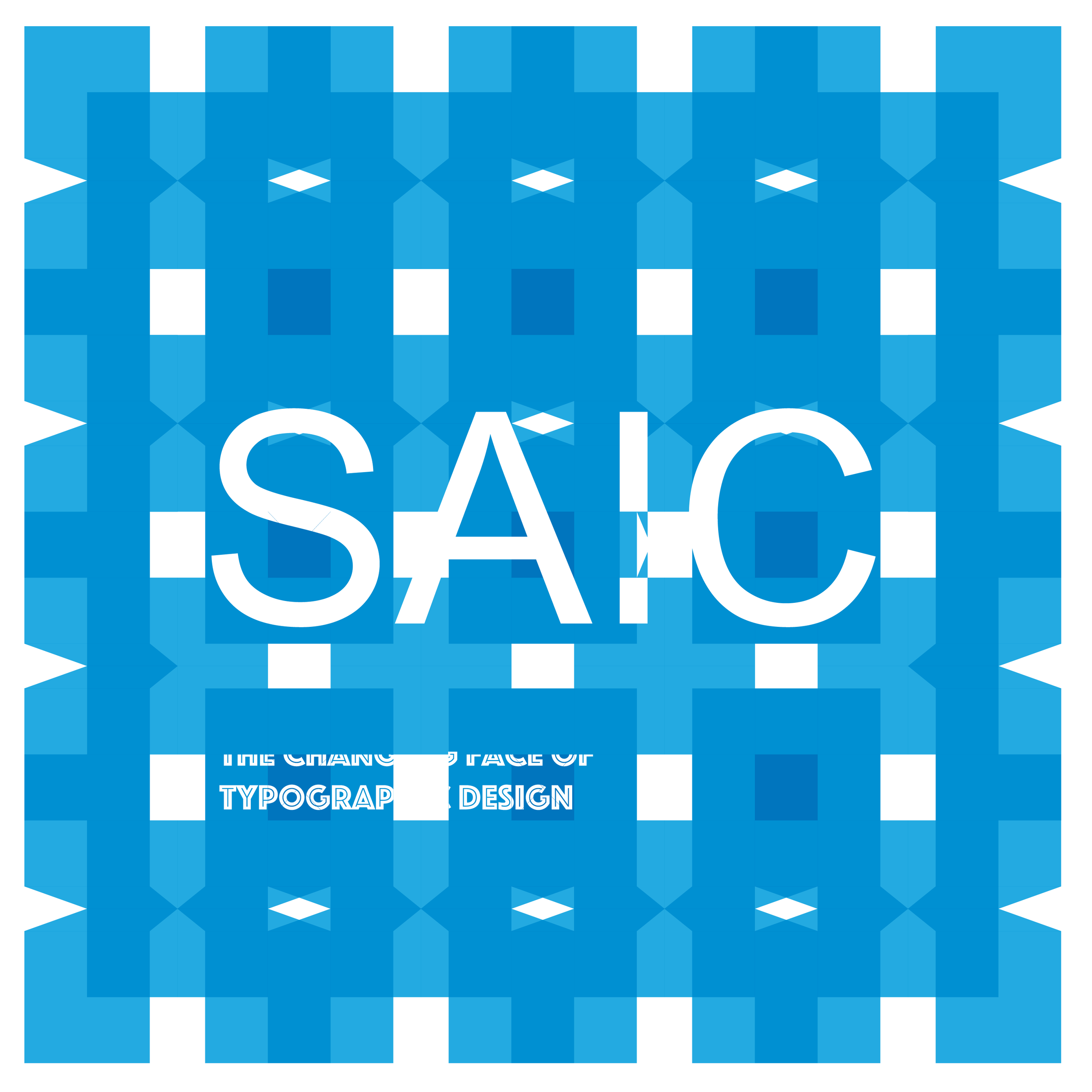
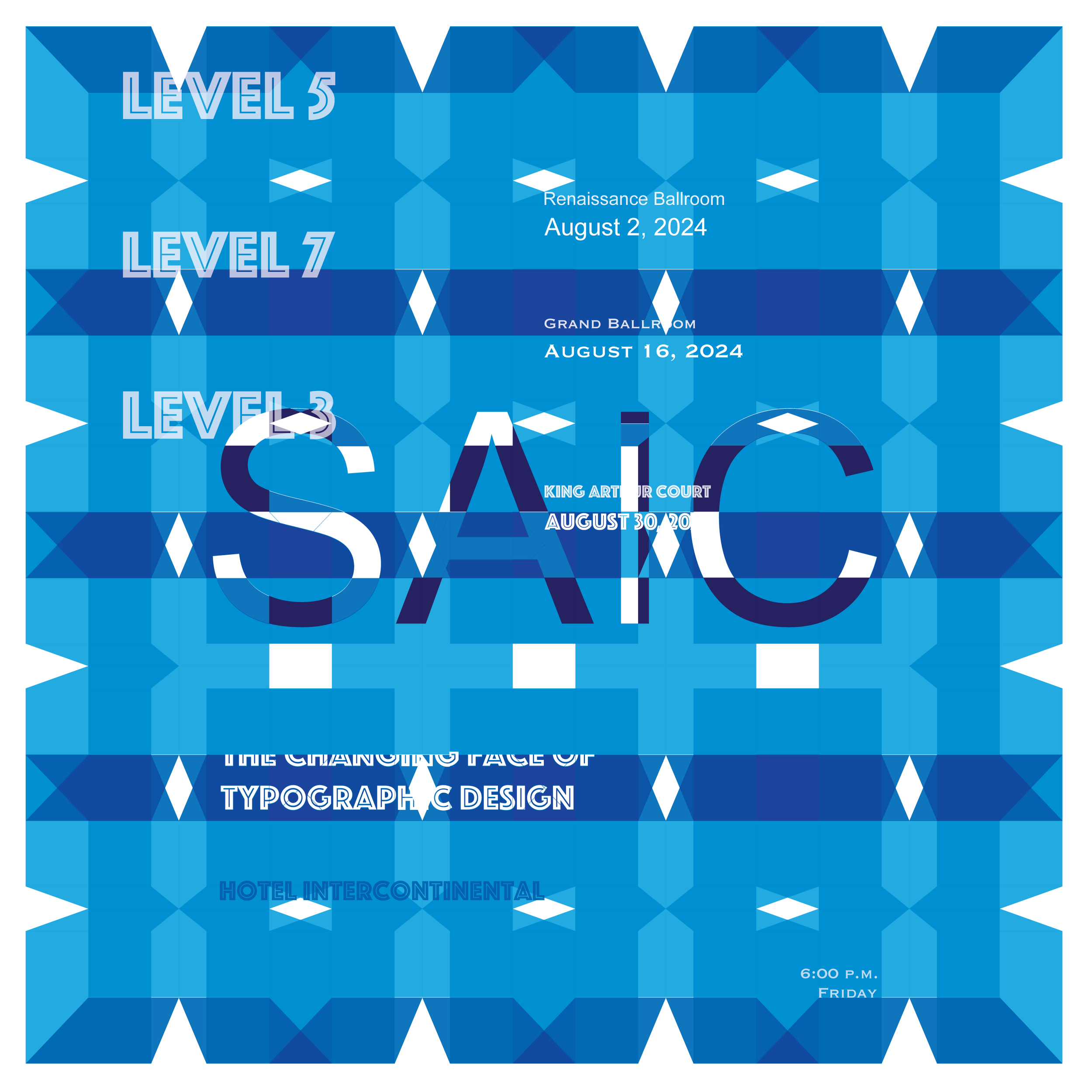
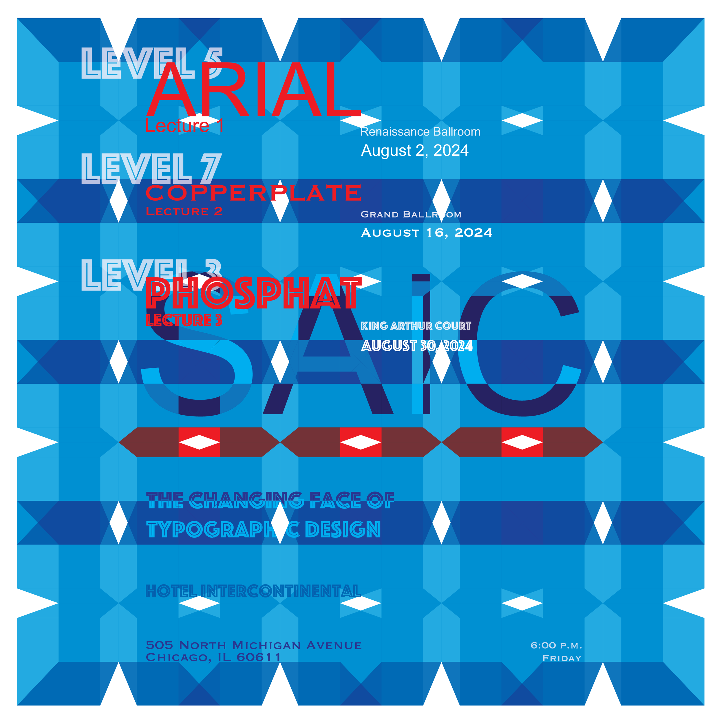
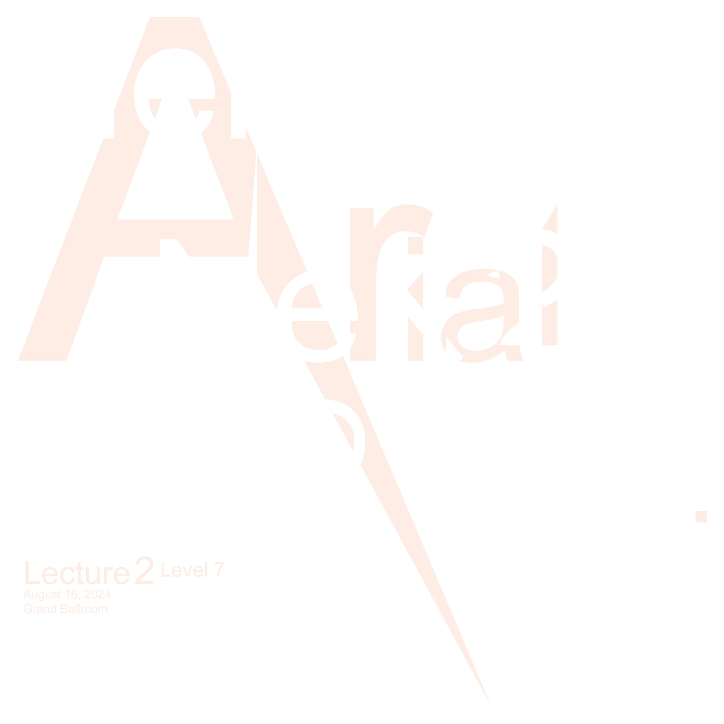
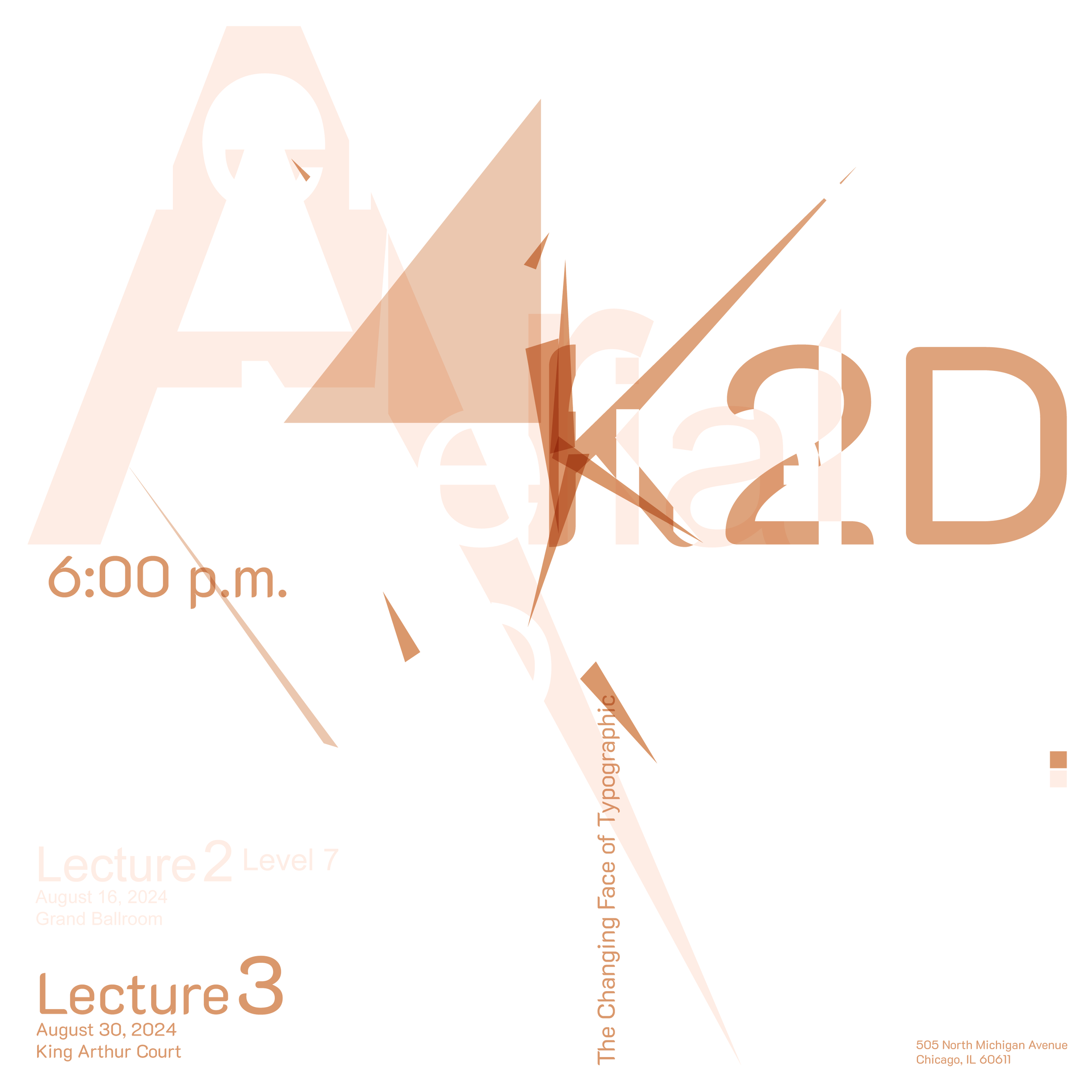
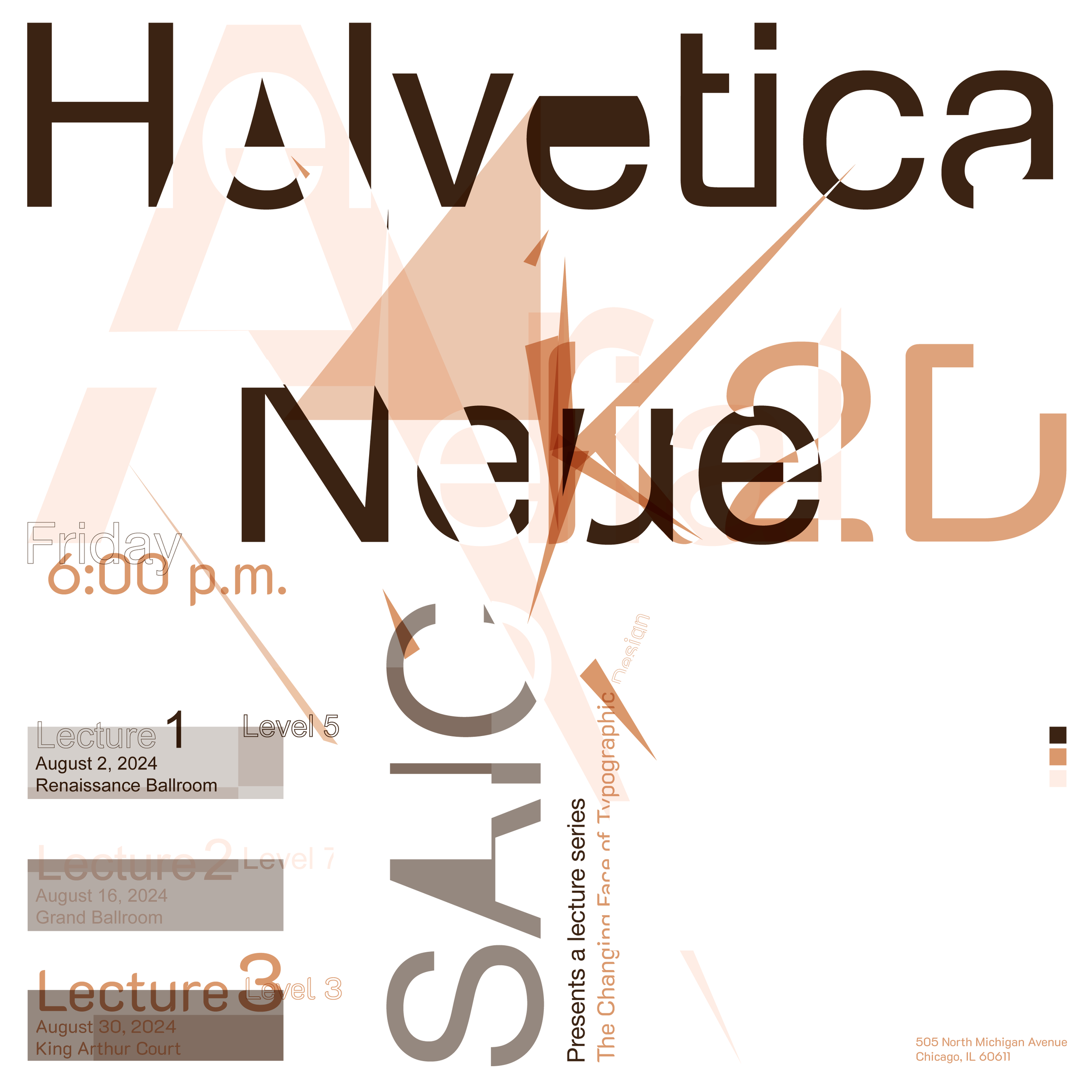
To create a three-poster suite announcing a lecture series entitled The Changing Face of Typographic Design. Each poster will showcase a typeface of consequence, and each typeface will exemplify an era of importance. The suite displays as a historical series; consider the progression of elements from one poster to another and the posters’ influence on the whole.
Each poster in a series prints as a single color. Poster 2 overprints poster 1; Poster 3 overprints poster 2, resulting in darker, richer compound shapes and color blends. This cumulative application of color simulates offset lithography, a printing technique that applies different colored inks to a single sheet of paper in one pass through the printing press.
Bookend posters pose a difficult challenge: if the first poster is overly simplistic, the message may not resonate; if the last poster is needlessly complicated, the message may not crystallize.
